


"It is far better to present approximate answers to the right question than perfect answers to the wrong question."
This section looks at the many ways in which gathered information can be analysed. It also describes different ways the results can be presented to information users. Beneficiaries play the major role in analysing the information and identifying an appropriate method to relay and discuss the results with others.
Some of the information gathering tools of PAME have "built-in" analysis and feedback, while the information that is gathered from others will need to be added up, or analysed in some way.
The focus of the data analysis will come mainly from the questions generated at the very beginning of the evaluation process. People sometimes work to conceptualize the monitoring and evaluation with painstaking care. They focus the questions before data collection begins. Then, once the data are collected and the analysis begins, they never look back to renew their understanding of the central issues and key questions that were to be answered. It is important to review the objectives and the purpose of the evaluation once again to make sure that the focus remains.
This does not mean that important results which were not anticipated should be ignored. It is best to maintain a balance between open-endedness and focus. The analysis can raise important, unforeseen, relevant questions. These can be noted for future reference and can be pointed out when communicating results.
The tools that have been used to collect the information will have a strong effect on the way the data is analysed and presented. Increases in crop productivity will entail, in part, quantification of results (adding up numbers), while a case study, a drama script or media presentation might entail an ongoing process of presentation and verification of the results by the community.
The mechanics of data organization for analysis will vary according to the thinking processes of different people. There may be both qualitative and quantitative data, and analysis may mean putting these together in a way that will relate CONTEXT (most often qualitative data) and EXTENT (most often quantitative data).
Take the questions that need to be answered. Gather together all relevant data that has been collected throughout the project. Some may have already been analysed or partly analysed. Some information may be "loose" but relevant.
It is useful to consider the following variables when doing the analysis:
CONTEXT: |
Examine events which have positively or negatively affected the project or the project's goals.
|
INPUTS: |
An accurate measurement of the time and material resources invested in the project.
|
PROCESS: |
A summary of evidence about what was done and how well it was done.
|
PRODUCT: |
Evidence concerning the results of the project, planned and unplanned.
|
Decide which data will help answer the initial questions, and then begin the analysis. Analysis can mean any of the following:
1. Adding up numbers.
2. Comparing information to estimate the similarity of one thing to another, or two things together.
3. Contrasting information by setting two things in opposition so as to show the differences.
4. Correlating information to establish relationships between pieces of information which may be related.
Quantitative data can be analysed using very straightforward techniques. It is likely that in a community situation, data will be analysed by hand. The equipment and the expertise to analyse data by computer may not be available to the community. It is important that the community be able to handle the analysis. Two straightforward methods of data analysis by hand can be used. These are tally sheets and summary sheets.
Tally Sheets show all possible responses and are useful for summarizing ad-analysing information such as production figures, survival figures or nursery records.
It will be especially important to give a lot of thought to what questions will yield the best information when "paired up". For example, species and survival and land types might be combined if community members felt that these might be significant when looked at in relation to each other. This "coupled" information might indicate that better species and site selection was warranted. The relationship between different data sets must be thought out beforehand; they will have a bearing on how the analysis is done.
Remember, the period of analysis is a time to be creative. A lot of important information can be revealed without losing the main purpose of the evaluation.
The tally sheet is an especially good method for summarizing data when literacy is not high. Sketches and/or writing can be used to signify the variables. When the tally sheet is prepared at a meeting or in a group, patterns in the results emerge in a way which everyone can see.
Using a tally sheet, a single stroke can be used to record, for example, each species, survival, and land type.
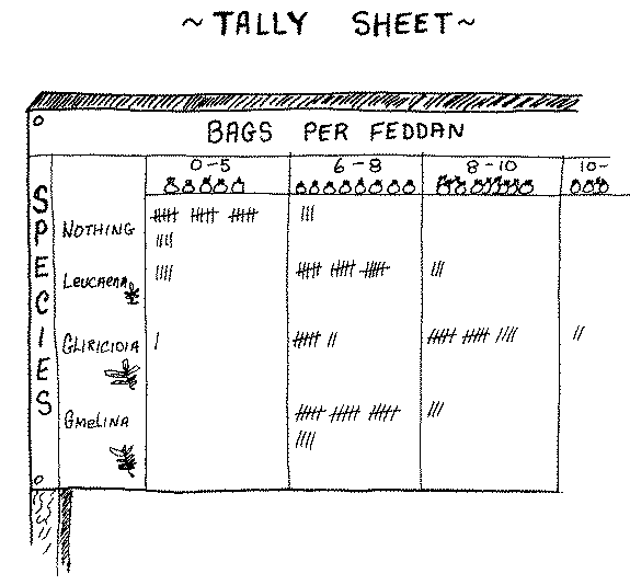
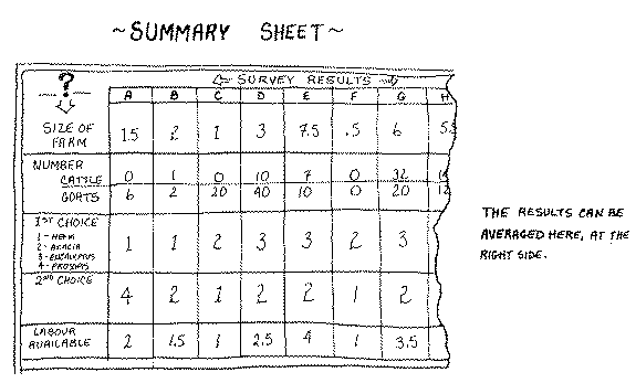
Using the tally sheet will not, however, show the answers from each respondent individually. To see clearly how each respondent has answered, a summary sheet can be used.
Summary Sheets are another simple way of recording responses, especially responses to a questionnaire survey. An example of the use of a summary sheet to record data from an informal survey is shown below. The letters A-H across the top represent each respondent:
The analysis of qualitative data is a creative and critical process. The approach is often determined by the kinds of information gathering tools that have been used. For example, if drawings of the community have been done at the beginning, middle and end of the project, these can be analysed by presenting the series of drawings to a number of individuals and asking them to:
- validate the drawings (are they truly representative, and if not, why not); and,
- rate the difference (very good, good, not very good).
A group meeting to present and discuss the validity and ratings of the drawings may be appropriate and less time consuming.
Analysing with the assistance of computers should be carefully considered, as this presents the danger of taking the control of the information away from the community. It is important to ask: "Will this kind of equipment and expertise be available to the community (or even in the country) after the formal project has phased out?"
There have been instances in which computers were introduced to projects and the computerized data was not accessible, even to project staff. At the beneficiary and field staff level, it is often better to keep data analysis as simple and understandable as possible.
Computers, however, may be appropriate where there is a large volume of information to synthesize. The information which is generated by beneficiaries in a participatory monitoring and evaluation system can be summarized at the community level and computerized for national data banks.
Sometimes it is better to not completely analyse results, so that the beneficiaries or the community as a whole can contribute to the analysis. When the community is involved more fully in the analysis, the possibilities for discussion are increased as information is not presented as FACTS. The results of the analysis are more likely to represent the range of projects and to be broadly accepted.
Once results have been obtained what should be done with them? What decisions will they influence? With whom should results be shared?
Too often, valid, reliable, vitally important results end up unused. It is important that the results reach the right people on time. Similarily, it is important that the results are given in a way that is understandable.
The major purpose of information is to assist in decision making. Therefore, the communication of results will be influenced to a large extent by WHO receives them, or WHO makes what decisions.
Feedback of results may go to any or all of the following potential information users.
Project beneficiaries |
-those persons or groups who participated directly with the project. |
Project staff |
-field staff, administrators, trainers. |
Others (not in order of importance)
Community Other communities National Headquarters |
-including non-beneficiaries in the community. -close-by, within or outside country. -country and programme managers.
|
National Forest Service |
- who have an interest in forestry projects.
|
Donors |
- those who have provided funds for the project.
|
Other Development Agencies |
- those working in related projects, those who might become interested in such activities.
|
General Public |
- either within or outside the country.
|
Research Organizations |
- within or outside country. |
After establishing who is interested in results, the method of feedback can be tailored to reach them. Ensure that the feedback will:
Service -who have an interest in forestry projects.
Be of interest: use a form of communication that catches the attention of the audience.
Be understandable: communicate in the language of the intended audience. This is not just a question of English, Swahili or Hindi, but also a question of "jargon" which may not be understood by community members.
Be convincing: the results should not be the opinions of only a few. It is important to present substantiated facts and information verified by community members who were not involved in the process of collection and/or analysis.
Be timely: in order to reach those who make decisions in time to provide them with information before final decisions are made.
Be simple: present the essential facts, clearly stated. It is difficult, though very necessary, to sort out what is "nice to know" from what is "necessary to know" in order to get the point across.
Be participatory: the community should decide what and how to communicate to other interested parties. It is their "story", and will be all the more powerful if they tell it in their own way.
The way to communicate results may be closely linked with the information gathering tools that have been used. For example, if a community case study was done on the evolution of management of a nearby natural forest, this could be acted out, video taped and edited by the community for distribution to a wider audience; or it could be dramatized and presented to a nearby community.
Although it takes some creativity, both quantitative and qualitative results can be combined for presentation. Think of a televised news story. Statistics are often reported alongside quotes or interviews of relevant people. They combine to effectively communicate a message to the audience.
If a written report is the chosen reporting method, here are some suggestions which can enhance the power of the report.
- Once you have identified your theme, stick to it.
- Having identified the audience, use imaginative language, introduce anecdotes related to local practice, hold the readers' interest.
- Identify the communication barriers that might exist and be sensitive to them.
- Include dialogue, quotations and illustrations. If people are discussed, they should not be merely statistics. They should be mobile characters who are active decisions makers: people who question, adopt or share innovations. Pictoral reports of activities or photographs can also enhance the report.
Strive to be brief and easily readable.
Graphics can be a way of presenting information clearly and concisely. These can be used in written reports, or newspapers, as handouts at meetings, or to make posters, slides, wall charts, and other visual materials.
(A) TABLES and GRAPHS
The main advantages of tables and graphs are that they:
- help to show key information quickly
- can enhance written reports
- can present the total picture in a smaller space
- can easily show comparisons, patterns, and trends
Points to Remember When Presenting Tables and Graphs:
1. Give the table or graph a full title.
2. Label the table or graph fully, both inside and outside the frame or box.
3. If symbols are used, provide a key to explain them.
4. List information sources (how, where, when information was obtained.
5. Include a date, with the day, month and year.
6. Choose the best method for the purpose. For example, use graphs to show trends, and bar charts to compare differences between similar information.
Both words and numbers can be presented in tables. For example, project plans, activities, or statements of progress can be listed. Figures relating to project finances, survival rates of seedlings, or production of different species can be presented this way. Some tables present only a few items of information. For example:
Table With a Few Items of Information
When the level of literacy is low, tables with words and basic numbers can sometimes be turned into symbols or pictures. This helps people to see, understand and remember the evaluation results:
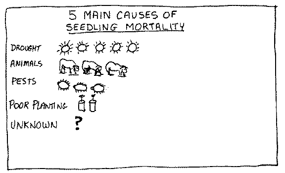
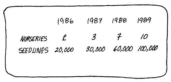
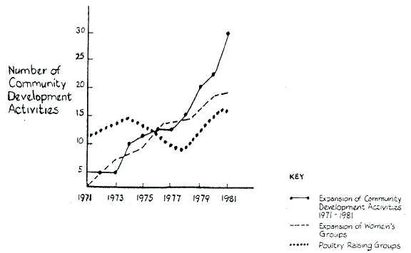
Graphs can present results clearly and effectively in a small space. They are often used to show several different results or sets of information at the same time. They can also show whether changes have occurred and when. In this way trends can be clearly seen:
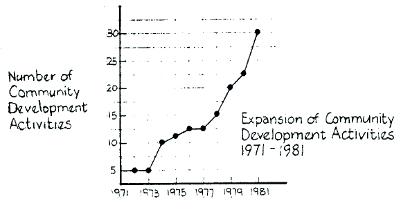 If a line graph is used, remember to:
- Label the graphs so that they read consistently.
- Place figures for the horizontal scale at the bottom, leaving the top of the graph clear.
- Place figures for the vertical scale on the left of the graph.
- Keep it simple, with as few lines as possible.
- Place zero point at the bottom left point of the vertical scale.
- Show equal increments on the scales to represent equal numbered units.
- Show scale divisions and units clearly.
- Have a vertical line linking each point to guide the eye, if it will help people understand.
A HISTOGRAM is a type of graph which shows the frequency of something, and it is useful for presenting limited and precise information. The horizontal scale shows the particular characteristic being presented, and the vertical scale shows the frequency with which the characteristic occurs. An example of a histogram:
(B) CHARTS
Results that can be presented in a graph can also be presented in a chart. A BAR CHART is used to compare different items of information at the same time. The length of each bar indicates the quantity that that bar represents. Unlike histograms, bar charts have spaces between the bars:
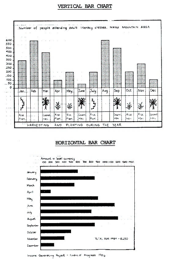
Some points to remember when presenting bar charts are:
- Arrange the bars in either ascending or descending order, to make the chart clearer.
- Bars can be arranged horizontally or vertically.
- Horizontal bars can contain words.
- Bars can be shaded or coloured.
- Precise numbers can be spaced over specific bars to indicate
- the number of cases on which each result is based.
- Label bars at the bottom and to the left of the chart.
- Provide a key.
- A second result can be shown by putting a second bar behind the first bar.
- A bar chart can easily be made into symbols or figures.
-
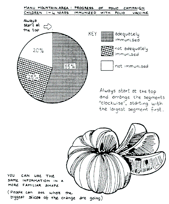
To show different parts of a whole in relation to one another, a PIE CHART can be useful. To use a pie chart effectively, it is best to liken the chart to a common round object, such as an orange, or a coin.
PIE CHART
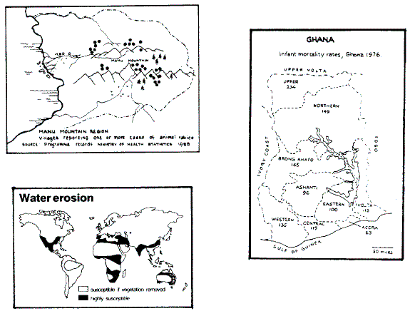
Different kinds of MAP CHARTS can present results visually in a way that helps people to understand. By using various patterns or colours it is possible to see at once the differences in specific variables in a total area.
MAP CHARTS
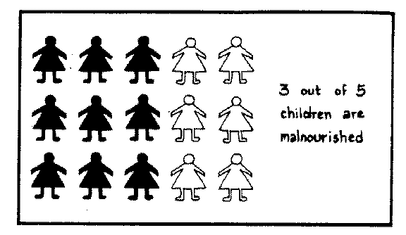
(C) PICTURES
The PICTOGRAM is a type of bar chart that uses pictures or symbols to present the data. Each symbol may represent a single person, or a particular unit of information.
PICTOGRAMS
Using CARTOONS to make a point can also be very effective. However, it generally requires some skill and training to produce good results. Some evaluation results can be turned into cartoons. People remember something that is interesting and amusing. The cartoons below were used to provide extensionists with the results of an evaluation of their project's monitoring and evaluation practices.
(D) OTHER METHODS
Drama, puppet theatre, story-telling, songs, etc. can all be used to present qualitative data in an interesting way, and they can easily be turned into slide-show presentations or videos for many information users.
Tape recordings can provide information for further analysis, communicate results to large gatherings or smaller groups, stimulate group discussion, and can provide materials for local radio broadcasts.
Whatever form the communication of results takes, remember to ensure that it is timely, understandable, relevant to the user, and gives reliable information.
