![]()
![]()
![]()
Food security is an important objective for all countries in the sample. Thus, it is important to examine the effects of the AoA on the food security status of developing countries. Has implementation of the Agreement facilitated countries in achieving greater food security, or has it made reaching this objective more difficult? The same methodological problem observed in the case of agricultural trade flows, that it is difficult to isolate the impact of the Agreement from the many other factors at work which influence food security, makes it difficult to reach definitive conclusions. A further factor is that other aspects of the URA, for example, the Agreement on Textiles and Clothing and the overall reduction in protection to manufactured goods, will also have impacted on food security through their overall impact on net trade earnings, employment and livelihoods.
One dimension of the food security issue is shown by the percent of the population undernourished in the sample countries (Figure 1). This varied from 46 percent of the total in Kenya to just 4 percent of the total in Egypt in the period 1997-1999. In 12 of the 22 countries for which data were available (Fiji was the omission), more than 20 percent of the population were undernourished in the second half of the 1990s.
Figure 1. Incidence of undernourishment in the sample countries.
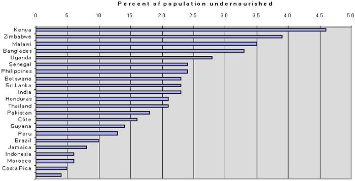
Source: FAO, State of Food Insecurity in the World 2001.
However, the situation has been improving in the majority of countries. In 18 of the 22 countries, the proportion of the population undernourished fell between 1990-1992 and 1997-1999. Four countries (Botswana, Morocco, Senegal and Uganda) experienced an increase in the proportion undernourished, although in the case of Morocco and Senegal, this was by one percentage point. Thus, this dimension of food security has improved in the great majority of the sample countries in the AoA implementation period. It is not possible to isolate the impact of the AoA in contributing to this improvement; indeed, in view of its limited trade effects documented in Section 3, the AoA is unlikely to have been significant in the period under review. However, the situation has been improving in the majority of countries, even though it is not possible to isolate the impact of the AoA in contributing to this situation.
It is possible to make a more direct link between the AoA, trade flows and food security by looking at trends in food availability in the sample countries over time. While the prevalence of undernutrition will be influenced both by average food availability and by the distribution of available food, average food availability plays the crucial role. Figure 2 shows that 90 percent of the differences between the sample countries in the proportion of their population undernourished can be explained by differences in average per capita calorie intake. Figure 3 shows a more demanding test, by comparing the improvement in the prevalence of undernutrition with the improvement in average per capita calorie availability. In this instance, 87 percent of the change in the percentage point prevalence of undernutrition can be explained by changes in per capita food availability. Based on the experience of the sample countries during the 1990s, for every 100-kcal improvement in per capita calorie intake, the prevalence of undernutrition fell by 6.5 percentage points.
Figure 2. Aggregate food availability vs. prevalence of undernutrition, sample countries, 1995-2000.
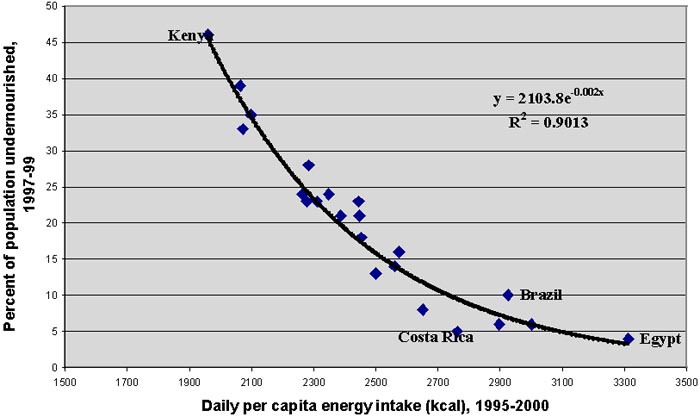
Source: Based on data in FAOSTAT, FAO State of Food Insecurity in the World 2001.
Given the close link between the prevalence of undernutrition and per capita food availability, it is not surprising to find that the pattern with respect to trends in per capita food availability is similar to that discussed above for trends in the prevalence of undernutrition (Table 8). Twenty of the 23 countries experienced an improvement in per capita calorie availability between the immediate pre- and post-AoA periods, the exceptions being Botswana, Senegal and Uganda. Morocco was the only country where per capita food availability increased at the same time as the prevalence of undernutrition. Table 8 also shows the trend in per capita cereal availability. This might be preferred as an indicator of the food security situation of poorer income groups because staple foods are likely to make up a higher proportion of their food consumption. However, in some countries, roots and tubers may make an important contribution to the diet of the poor, but such consumption is not captured by this indicator. Per capita cereal supply increased in all countries between the pre- and post-AoA period except for Bangladesh, Honduras and Senegal.
Figure 3. Change in average food availability vs. change in prevalence of undernutrition, sample countries during the 1990s.
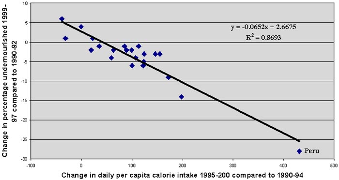
Source: Based on data in FAOSTAT, FAO, State of Food Insecurity in the World 2001.
From a food security viewpoint, it may be significant whether the increase in food availability per capita is provided by domestic production or imports. A situation where increased per capita food availability is due to increasing domestic production accompanied by falling imports, or even by increasing imports, may be seen as strengthening food security. However, a situation where per capita food availability is decreasing because of falling domestic production, or even where it is increasing but only because per capita food imports are growing even more rapidly, may be seen as unsustainable in food security terms in the longer term without a concomitant rise in export earnings.
However, it is very difficult to draw a clear interpretation of the consequences of changes in the composition of food supplies between domestic production and imports for food security without more information on the specific country context. For example, domestic production may be growing and displacing imports only because a country is increasing protection to its agricultural sector. However, a country which experiences falling production and a growing dependence on food imports may simply be shifting resources to non-farm sectors such as tourism or light manufacturing where growth and employment opportunities may be more attractive.
Table 8. Trends in per capita food availability
|
Country |
Total energy intake (kcal) per capita (daily) |
Cereals supply per capita |
||||
|
1985-89 |
1990-94 |
1995-2000 |
1985-89 |
1990-94 |
1995-2000 |
|
|
Bangladesh |
2 041 |
2 053 |
2 072 |
187.0 |
188.3 |
187.4 |
|
Botswana |
2 336 |
2 317 |
2 278 |
194.0 |
149.2 |
158.2 |
|
Brazil |
2 731 |
2 801 |
2 925 |
285.0 |
296.2 |
314.7 |
|
Costa Rica |
2 714 |
2 727 |
2 762 |
175.9 |
181.5 |
233.3 |
|
Côte d’Ivoire |
2 570 |
2 429 |
2 575 |
135.5 |
126.7 |
151.5 |
|
Egypt |
3 082 |
3 199 |
3 312 |
329.6 |
352.3 |
384.5 |
|
Fiji |
2 597 |
2 690 |
2 794 |
148.5 |
165.6 |
168.3 |
|
Guyana |
2 462 |
2 438 |
2 561 |
212.2 |
203.3 |
206.4 |
|
Honduras |
2 226 |
2 324 |
2 387 |
161.6 |
174.5 |
169.0 |
|
India |
2 266 |
2 355 |
2 444 |
177.6 |
181.7 |
183.7 |
|
Indonesia |
2 507 |
2 742 |
2 897 |
199.8 |
216.7 |
237.9 |
|
Jamaica |
2 576 |
2 544 |
2 651 |
166.9 |
177.7 |
181.4 |
|
Kenya |
2 056 |
1 875 |
1 960 |
141.0 |
124.6 |
134.1 |
|
Malawi |
2 018 |
1 899 |
2 097 |
187.9 |
181.0 |
195.6 |
|
Morocco |
2 985 |
2 978 |
3 000 |
339.4 |
311.9 |
313.7 |
|
Pakistan |
2 227 |
2 331 |
2 453 |
165.2 |
176.9 |
181.7 |
|
Peru |
2 226 |
2 069 |
2 500 |
166.7 |
164.5 |
197.0 |
|
Philippines |
2 211 |
2 249 |
2 348 |
205.2 |
203.0 |
207.7 |
|
Senegal |
2 259 |
2 296 |
2 264 |
222.0 |
198.7 |
189.4 |
|
Sri Lanka |
2 312 |
2 210 |
2 310 |
156.8 |
152.1 |
158.9 |
|
Thailand |
2 261 |
2 276 |
2 448 |
210.8 |
213.7 |
235.4 |
|
Uganda |
2 190 |
2 284 |
2 283 |
84.7 |
94.6 |
101.3 |
|
Zimbabwe |
2 143 |
2 004 |
2 063 |
217.7 |
198.7 |
202.8 |
Source: FAOSTAT; FAO State of Food Insecurity in the World 2001.
At least with respect to cereals, some of the case study countries appear to have become more trade-dependent in the last part of the decade. This is also evident if trends in self-sufficiency ratios (SSRs) for key staple products are examined (Table 9). The cereals SSR declined between 1990-1994 and 1995-2000 in 12 out of 23 countries, the vegetable oils SSR in 16 countries, the sugar SSR in 13 countries and the meat SSR in just seven countries. Individual countries have not necessarily become more dependent on imports for their food supplies in the post-AoA period, and there is clearly a wide variety of specific experiences. The individual case studies explore these differences in more detail.
Whether there is evidence of imports displacing domestic production is more difficult to say. There is indeed a small negative correlation between increases in imports and increased domestic production (R2 = 0.25), implying that, as imports increase, domestic production falls. However, it is not possible to assert a causal relationship on the basis of this simple correlation. It is equally plausible that the negative correlation is observed because a shortfall in domestic production (owing to poor weather, for example) means that a country turns to imports to secure sufficient food supplies. In this case, additional imports are a sign that food security has been strengthened, not diminished.
Table 9. Self-sufficiency ratios for some major food commodities (computed from FAO data)
|
Country |
Meat |
Sugar |
Vegetable oils |
Cereals |
||||||||
|
1985-89 |
1990-94 |
1995-2000 |
1985-89 |
1990-94 |
1995-2000 |
1985-89 |
1990-94 |
1995-2000 |
1985-89 |
1990-94 |
1995-2000 |
|
|
Bangladesh |
1.01 |
1.00 |
1.00 |
0.90 |
0.94 |
0.78 |
0.29 |
0.38 |
0.30 |
0.89 |
0.87 |
0.91 |
|
Botswana |
2.31 |
1.49 |
1.70 |
0.00 |
0.00 |
0.01 |
0.05 |
0.06 |
0.07 |
0.22 |
0.22 |
0.17 |
|
Brazil |
1.07 |
1.08 |
1.09 |
1.32 |
1.34 |
1.84 |
1.42 |
1.29 |
1.37 |
0.93 |
0.82 |
0.82 |
|
Costa Rica |
1.25 |
1.15 |
1.13 |
1.32 |
1.46 |
1.65 |
0.98 |
1.28 |
2.18 |
0.52 |
0.31 |
0.23 |
|
Côte d’Ivoire |
0.82 |
0.81 |
0.94 |
1.01 |
1.08 |
0.94 |
2.23 |
2.44 |
1.64 |
0.60 |
0.62 |
0.63 |
|
Egypt |
0.78 |
0.86 |
0.88 |
0.62 |
0.63 |
0.60 |
0.20 |
0.14 |
0.13 |
0.51 |
0.63 |
0.65 |
|
Fiji |
0.70 |
0.61 |
0.64 |
17.92 |
27.69 |
20.99 |
1.07 |
0.77 |
0.59 |
0.19 |
0.14 |
0.09 |
|
Guyana |
0.98 |
0.61 |
0.69 |
5.50 |
7.59 |
9.11 |
0.60 |
0.81 |
0.68 |
1.06 |
1.30 |
2.38 |
|
Honduras |
1.17 |
1.19 |
0.97 |
1.41 |
1.00 |
1.16 |
1.30 |
1.16 |
1.07 |
0.76 |
0.75 |
0.66 |
|
India |
1.02 |
1.02 |
1.04 |
0.93 |
1.02 |
1.06 |
0.79 |
0.92 |
0.75 |
1.00 |
1.02 |
1.03 |
|
Indonesia |
1.00 |
1.00 |
0.99 |
0.92 |
0.93 |
0.64 |
1.51 |
1.83 |
2.21 |
0.96 |
0.93 |
0.88 |
|
Jamaica |
0.62 |
0.69 |
0.67 |
1.72 |
1.68 |
1.70 |
0.48 |
0.63 |
0.15 |
0.01 |
0.01 |
0.01 |
|
Kenya |
1.00 |
1.00 |
1.00 |
0.87 |
0.91 |
0.85 |
0.21 |
0.17 |
0.16 |
1.03 |
0.93 |
0.73 |
|
Malawi |
1.00 |
0.99 |
0.99 |
1.82 |
1.29 |
1.22 |
0.81 |
0.34 |
0.51 |
0.92 |
0.79 |
0.97 |
|
Morocco |
0.98 |
0.99 |
1.00 |
0.60 |
0.57 |
0.47 |
0.32 |
0.38 |
0.35 |
0.84 |
0.76 |
0.53 |
|
Pakistan |
1.00 |
1.00 |
1.00 |
0.89 |
1.01 |
1.01 |
0.33 |
0.31 |
0.28 |
1.07 |
1.00 |
1.03 |
|
Peru |
0.93 |
0.98 |
0.98 |
0.78 |
0.69 |
0.66 |
0.48 |
0.36 |
0.37 |
0.54 |
0.42 |
0.47 |
|
Philippines |
0.99 |
0.98 |
0.94 |
1.12 |
1.14 |
0.89 |
3.74 |
3.02 |
2.93 |
0.88 |
0.86 |
0.78 |
|
Senegal |
0.96 |
0.99 |
0.99 |
0.95 |
0.74 |
0.62 |
1.78 |
0.98 |
0.78 |
0.65 |
0.59 |
0.53 |
|
Sri Lanka |
1.00 |
0.99 |
0.98 |
0.13 |
0.16 |
0.13 |
1.29 |
0.62 |
0.41 |
0.64 |
0.64 |
0.60 |
|
Thailand |
1.08 |
1.12 |
1.16 |
3.42 |
3.37 |
3.20 |
1.05 |
0.93 |
1.17 |
1.61 |
1.40 |
1.41 |
|
Uganda |
1.00 |
1.00 |
1.00 |
0.41 |
0.73 |
0.78 |
0.71 |
0.46 |
0.19 |
0.98 |
0.99 |
0.87 |
|
Zimbabwe |
1.15 |
1.14 |
1.13 |
1.80 |
1.29 |
1.58 |
0.98 |
0.78 |
0.61 |
1.35 |
0.97 |
0.90 |
Table 10. Indicators of food import capacity
| |
Food imports as percentage of total exports of goods and services |
Food imports as percentage of total exports of goods and services minus debt service payments |
Cereal food aid (tonnes) |
||||||
|
1985-89 |
1990-94 |
1995-99 |
1985-89 |
1990-94 |
1995-99 |
1985-89 |
1990-94 |
1995-99 |
|
|
Bangladesh |
48.9 |
21.9 |
21.2 |
64.9 |
27.0 |
24.0 |
1 452 831 |
1 048 590 |
802 732 |
|
Botswana |
7.7 |
10.3 |
13.8 |
8.1 |
10.7 |
14.4 |
44 213 |
5 137 |
208 |
|
Brazil |
4.5 |
5.4 |
7.0 |
7.7 |
7.1 |
20.3 |
13 552 |
18 677 |
0 |
|
Costa Rica |
5.1 |
5.5 |
6.1 |
7.1 |
6.8 |
6.7 |
110 301 |
26 684 |
81 |
|
Côte d’Ivoire |
10.7 |
10.9 |
8.5 |
16.4 |
16.7 |
11.9 |
9 474 |
47 530 |
30 488 |
|
Egypt |
42.0 |
18.6 |
20.2 |
54.7 |
22.5 |
22.7 |
1 668 003 |
784 043 |
94 413 |
|
Fiji |
10.0 |
9.6 |
8.6 |
11.3 |
10.7 |
9.6 |
1 164 |
0 |
0 |
|
Guyana |
7.6 |
8.0 |
6.8 |
10.6 |
9.7 |
8.3 |
38 497 |
41 187 |
37 327 |
|
Honduras |
7.9 |
10.1 |
13.1 |
10.9 |
14.6 |
15.5 |
125 852 |
105 972 |
60 712 |
|
India |
7.6 |
3.4 |
4.9 |
10.7 |
4.7 |
6.4 |
292 747 |
272 339 |
297 102 |
|
Indonesia |
3.6 |
3.4 |
5.6 |
5.7 |
5.1 |
8.5 |
171 198 |
42 510 |
366 231 |
|
Jamaica |
12.5 |
9.8 |
11.7 |
20.7 |
12.9 |
13.8 |
255 164 |
179 273 |
29 037 |
|
Kenya |
6.2 |
10.9 |
12.9 |
10.1 |
16.0 |
16.6 |
113 007 |
177 240 |
84 537 |
|
Malawi |
10.6 |
29.7 |
13.2 |
17.2 |
39.3 |
17.5 |
142 773 |
289 416 |
64 419 |
|
Morocco |
10.8 |
9.9 |
12.3 |
15.9 |
14.7 |
16.6 |
311 961 |
155 545 |
8 695 |
|
Pakistan |
18.0 |
12.9 |
15.2 |
24.0 |
17.3 |
22.0 |
532 027 |
229 812 |
134 522 |
|
Peru |
16.5 |
17.0 |
13.7 |
19.7 |
23.0 |
20.2 |
244 612 |
405 147 |
88 617 |
|
Philippines |
5.5 |
6.0 |
5.9 |
8.0 |
7.9 |
6.8 |
241 777 |
61 416 |
36 880 |
|
Senegal |
21.2 |
24.1 |
26.3 |
29.4 |
28.7 |
33.5 |
94 005 |
47 842 |
17 223 |
|
Sri Lanka |
20.3 |
13.8 |
12.3 |
25.4 |
15.6 |
13.3 |
307 072 |
314 764 |
74 031 |
|
Thailand |
1.7 |
1.5 |
1.7 |
2.2 |
1.8 |
2.0 |
85 404 |
55 203 |
2 428 |
|
Uganda |
5.5 |
15.2 |
20.3 |
10.8 |
37.5 |
27.0 |
24 948 |
50 618 |
58 230 |
|
Zimbabwe |
1.1 |
6.8 |
4.8 |
1.6 |
9.3 |
6.8 |
16 818 |
202 711 |
18 210 |
Source: FAOSTAT; World Development Indicators CD-ROM 2001.
Dependence on food imports can flag a food security problem at the national level if a country is likely to have difficulty in paying for these imports. A useful indicator of food import capacity is the share of food import expenditure in total exports of goods and services. Because, for many developing countries, a proportion of foreign exchange earnings is earmarked for debt service and thus not available to import food, the ratio can also be expressed as the share of food import expenditure in total exports of goods and services minus debt service payments.
Food imports accounted for 12.4 percent of total exports of goods and services in 1985-1989, for 11.5 percent in 1990-1994 and for 11.6 percent in 1995-1999. The trend is clearer when debt service payments are taken into account. The share of food imports in the three time periods is then 17.1 percent, 15.6 percent and 15.0 percent. Thus, the capacity to pay for food imports has improved in developing countries over the past decade, despite a gradual hardening of the prices of those foods most often found in the import basket of developing countries (Table 10).
Table 11. Nominal world prices (US$/tonne) for some food commodities
|
Commodity |
Average annual prices |
||
|
1985-89 |
1990-94 |
1995-99 |
|
|
Wheat |
137 |
142 |
158 |
|
Rice |
237 |
279 |
315 |
|
Maize |
99 |
106 |
119 |
|
Beef |
2 344 |
2 575 |
1 838 |
|
Poultry |
1 767 |
971 |
821 |
|
Dairy products |
1 260 |
1 603 |
1 825 |
|
Sugar |
176 |
232 |
228 |
|
Fats, oils and oilseeds |
339 |
369 |
434 |
Source: FAO data.
Nonetheless, this average statement is not necessarily true for all countries in the sample. For 14 of the 23 countries in the sample, the burden of paying for food imports has risen in the 1995-1999 period compared with 1990-1994 (Table 11). Countries where the share of food import expenditure in total export earnings (including debt service) has been increasing include Botswana, Brazil, Honduras, Indonesia, Kenya, Senegal, Uganda and Zimbabwe. For the low-income countries in this group, food aid flows can be important in helping to ensure increased food availability at the national level. Food aid flows to the sample countries, however, have been falling. Many of the individual case studies noted that the Marrakesh Decision on Measures Concerning the Possible Negative Effects of the Reform Programme on Least-Developed and Net Food-Importing Developing Countries has not been implemented, and called for more binding commitments to be included in a future Agreement.
The most likely groups to benefit from the reduction of trade barriers in foreign markets and the expansion of exports are commercial producers. Small farmers may not be able to participate in growing export-oriented crops and may experience greater competition in accessing resources, including land, marginalizing their position even further. The winners and losers of open trade policies are likely to be different, and it is feared that it is often the poor who are hurt most. For example, the Peruvian case study noted that fresh and processed asparagus, which emerged as the most dynamic export crop in the 1990s, is produced mainly by large farms. Greater export opportunities may also lead to the reallocation of land and other resources away from domestic food production, with possible adverse consequences for household food security.
Whether the position of the poor worsens or not under more open agricultural trade policies, however, depends on much more than what happens in the agricultural sector alone. For example, the availability of non-farm employment in rural areas, the functioning of rural labour markets and the impact of production and trade policies on food prices will all determine how income distribution, poverty and thus food security are affected. The Peruvian case is also instructive here. In Peru, the incidence of poverty decreased between 1990 and 1994, but increased again in 2000 owing to economic recession. However, the proportion of extreme poor, which is deemed a more appropriate indicator of the number of food-insecure people, continued to fall even during the latter period. The case study concludes that any potential negative effects of agricultural trade trends on the rural poor were offset by positive developments in non-agricultural employment and in social welfare interventions. The National Food Program agency is seen as having played an important role in upgrading the social welfare of the poor in both the cities and rural areas of Peru in the 1990s.
Trends in the incidence of poverty and the number of households in poverty may be the best indicator to capture the totality of effects on the food security of lowincome households. The incidence of poverty has declined in a number of the case study countries, including India, Jamaica and Costa Rica. Poverty indicators also improved during the 1990s in Honduras. In the first half of the decade, the positive impact was greater in rural than in urban areas, consistent with the view that structural reforms were redressing the anti-agricultural bias of previous macroeconomic and sectoral policies. In the second half of the decade, the drop in urban poverty continued but halted in rural areas, while the proportion of extreme poor increased. Hurricane Mitch appears to be mainly responsible for this trend. Evidence also suggests that the proportion of poor households increased in Senegal and Egypt in the second half of the 1990s. In Uganda, poverty has declined, although there has been little improvement in income distribution, and income gains in rural areas accrued to relatively few households. There is conflicting evidence from the Philippines, where the head count index of poverty increased in the 1997-2000 period, but the family count index decreased albeit in the earlier period 1985-1994. An understanding of these trends in poverty rates and the reasons for differences between countries would require a much deeper analysis than that possible in the case studies.
![]()
![]()
![]()